


1.01KViews
 Earlier today, IDW Comics announced it’s summer crossover event, a miniseries with several companion miniseries pitting the majority of the companies Hasbro properties against one another. It was yet another major publisher attempting to capture the news cycle from events, relaunches or any number of stunts used to re-engage comics buyers with their product outside of simply the quality of the product in and of itself. Today alone saw four relaunched DC series, Civil War II #1 and the debut of an additional Power Rangers comic to the main series with SEVEN different variant covers. All this just one week after the controversial one two punch of DC Universe Rebirth & Captain America Steve Rogers. In the midst of all the hype and spectacle, Michel Fiffe dropped an e-mail on Monday letting all his subscribers know there’s a new Copra miniseries about villains, it was available this week with the first issue about Dy Dy. And here we are.This is Dy Dy
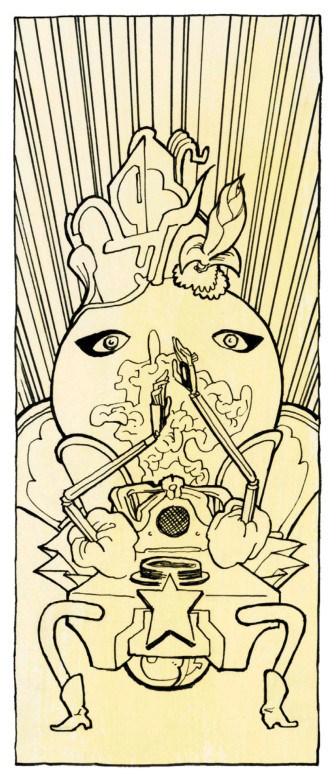
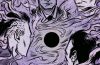
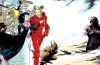
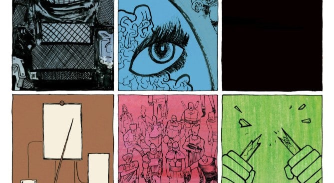
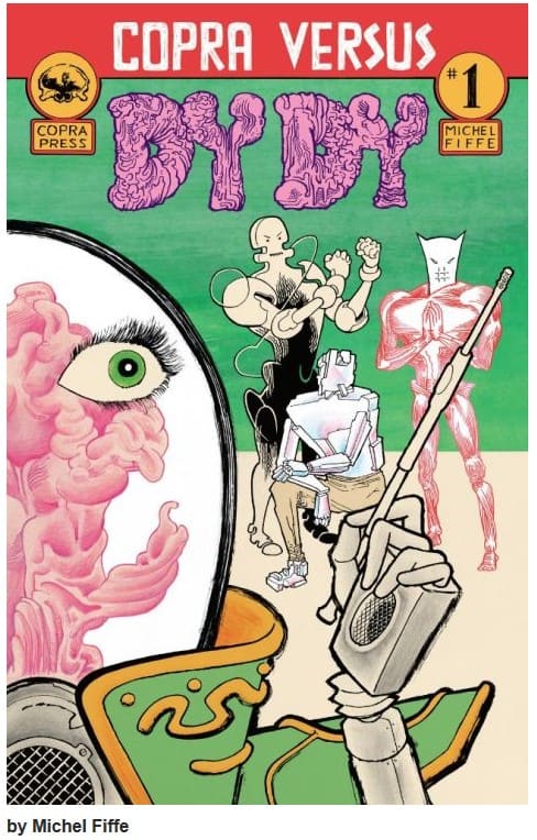
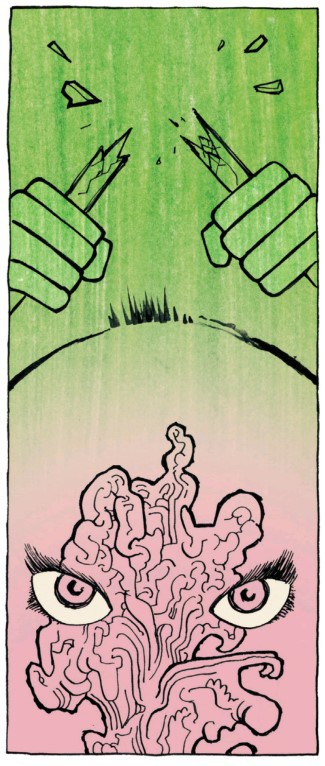
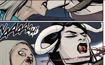
Like most of Copra’s cast, Dy Dy is equal parts awesome and ridiculous with a highly imaginative design that could only come from Fiffe. The big bad in the series opening, Copra Versus #1 circles back to focus in on her life story leading up to the series inception by using small moments to capture a lifetime of tragedy. Copra Versus #1 is told by having each page as a six panel grid of the same size, pattern and layout. Each panel represents a moment in time progressing the story. Some panels are within moments of one another, other’s can represents anywhere from days to months apart. Lacking any word balloons, all the dialogue is in small boxes below the panels occasionally without any text whatsoever.
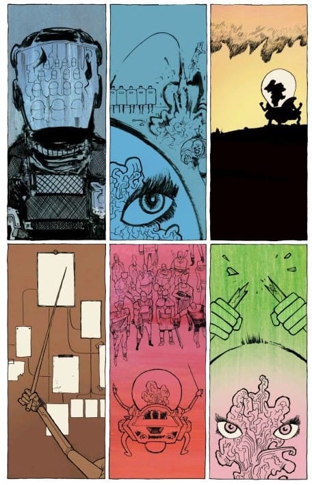 It’s a comic where it’s sparseness becomes expansive as it’s series of moments come together to create a sweeping tapestry of life being fractured by war and dysfunction. Each panel is like it’s own little story which helps create an expansive and lived in world that will turn one women with a severe skin disorder into a tyrannical super villain and dictator. FIffe’s art is astounding here, even by his standards. His illustrations are at time hyper detailed, in others sparse silhouettes and often some combination of the two while his color contrast is eye catching and almost hypnotizing the way he shades from one hue to the other. While Copra is a DIY comic, Fiffe uses that to the books strength by making the rough lines a part of the visual story telling. With that, the comic has a unique aesthetic that add’s an element to the composition that is singular to Copra alone, partially because he is doing it all himself but also because nobody else makes comics that look like this. His art and text captures the moments of Dione’s transition to Dy Dy in a way that gives Copra Versus #1 a stark and sobering humanism. There are single panels with more story in them then a lot of full length single issue comics.
Fiffe keeps coming up with ways to make Copra even better as a book that is unafraid of taking chances, burrowing into it’s own mythology and experimenting with the mediums format while staying consistent to the quality and style that made it the great series it was in the first place. Copra Versus #1 is a lot of stories about one story, a lot of people shaping one person and one person shaping the world. One single comic about one character and it ends up being more then anything I could’ve asked for or expected.